Introducing the Kenneth Crane Collection

Once in a while, we meet another artist whose work is so inspiring, we just have to figure out a way to collaborate. Enter Kenneth Crane, a Colorado illustrator who seemed like he must have been bred from the same test tube and spliced from the same creative genes as ADG founder Joel Anderson. When the two artists struck up a friendship, the idea for a fresh new National Parks poster series began to evolve.
Joel describes Kenneth: "His sense of composition, color and light reminded me of the master illustrators of the early 20th Century. Kenneth is a true artist—sure, he's technically skilled at his craft, but he sees and imagines things that the average illustrator would miss. His ability to choose a subject and then illuminate what is awe-inspiring about it—his mind's eye is what drew me to his work. Then when I met him, I got the added pleasure of discovering a hard-working, cheerful, humble, young professional. He's got integrity and a real depth of character which makes our collaboration all the better. I truly think he will become one of the great illustrators of this new generation."
Now that the series is taking shape, we thought it would be fun to introduce Kenneth to our fans and followers. Here is an interview that Joel did with him recently...


Joel: How did this collaboration with ADG come about?
Kenneth: That’s a funny story actually. My coworker was having a National Park-themed baby shower and commissioned me for an illustration of Rocky Mountain National Park for her invitations. I enjoyed the project so much, I thought why stop there? So I created illustrations for Arches National Park and Great Smoky Mountains National Park. Suddenly I had a series going and I knew I wanted to shoot for all 61 parks. During my visual research, ADG kept popping up in my Pinterest feed as a reputable source so I reached out to Joel to see if ADG would partner with me to launch a new series of National Parks poster art. From the very beginning the relationship just clicked. I am very blessed to work with ADG. Joel is one of the finest people I’ve had the pleasure of working with, and all because of a coworker’s baby shower. It’s true, you never know what seeds you plant will reap an opportunity.

Joel: Who are some of your artistic influences?
Kenneth: I can never get enough of N. C. Wyeth. I specifically love his interpretations of Treasure Island and The Black Arrow. His compositions are so dramatic and almost take on a graphic novel quality. He is the reason I always strive to have strong focal points in my pieces.


Above: 2 paintings by N.C. Wyeth
Another, more personal influence is Charles Peer, my soft pastel instructor. I was lucky enough to schedule an independent study with him for an entire semester in college. As an expert in plein air painting, he has cultivated my love of landscapes and refined my understanding of color.

Above: a painting by Charles Peer
Joel: Why create another series of National Parks art?
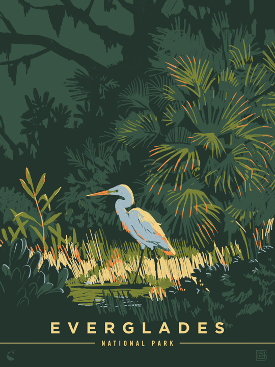
Kenneth: I think this series has a fresh take on National parks that I haven’t seen yet. I love the way light plays with color. That’s what I specifically look for when I visit these parks, and I wanted to create a series that showcases that beautiful phenomenon. Whether it is the alpenglow on the Rockies or a sunrise in Arches, or a sun patch in the Everglades, I am always on the search for the most dramatic light possible. I want to bring plein air painting to 1920s poster design and illustration.

Above: a painting by Charles Peer
Joel: Describe your creative/idea process.
Kenneth: I like to gather inspiration on location, so for this series I prefer to visit as many parks as possible. I take lots of pictures looking for dramatic lighting and intriguing compositions, then couple this primary research with online visual research. I’ve found Pinterest to be especially helpful in curating a good source of photography as well as existing artwork. By researching other artist’s interpretations of the parks I am able to avoid trends and cliches. This is key in keeping originality.

Oftentimes an illustration begins with a spark of inspiration when I am least expecting it. Perhaps it is a picture I took years ago that pops up in my Facebook feed. Or a combination of pins on Pinterest. Or a color palette from a painting in a museum. All of these scenarios have sparked ideas for posters. The trick is to keep my eyes open for inspiration wherever I am and then to keep a running log of it for future reference. For instance, I took the top photo on a backpacking trip with my brother and found the bottom photo on the NPS website to inspire the final illustration for the Grand Teton National Park poster.

Joel: Describe your illustration/execution process.
Kenneth: I use a Wacom tablet in Photoshop from start to finish. Beginning with a sketch, I block in the composition and test out color palettes using the visual research I have gathered. Rather than layering the composition, I am accustomed to working on one layer like a painting. This gives me a sense of spontaneity and keeps my illustrations loose and expressive, forcing me to paint over and massage any mistakes along the way. As the piece progresses, I work in the details and adjust the color as necessary to achieve the final look.


Joel: What advice do you have for aspiring artists?
Kenneth: Repetition. Create new pieces over and over and over again. I’d recommend starting out with initiatives such as Inktober or 36 Days of Type to jumpstart the habit. From there you begin to hone in on what comes naturally to you, what takes you too long, what inspires you, and what frustrates you. Simply adapt your style to what fits your lifestyle. Ask yourself, could I do this day after day and enjoy it? I once thought pastel painting would be my signature style, but after realizing it took too long to do a simple sketch, I transitioned to digital illustration. I found I could start, continue or end a project in a matter of minutes. This reduced the barriers between me and creating new pieces. Digital illustrations became my go-to medium which then became my style, and now my craft.
Joel: What is your favorite flavor of ice-cream?
Kenneth: Salted Caramel is by far the best. I could eat a whole bucket… not that I’ve done that.
Joel: If you could be an animal for one day, what would you be?
Kenneth: My dog. She is the most spoiled German Shorthaired Pointer out there. I don’t blame her. I’d be spoiled to if I slept all day, chased the occasional rabbit and went on long runs along the city trail only to come home and have dinner served on a silver platter. I guess the phrase “it’s a dog’s life” is appropriate.

Joel: Who is the one person in history (any era) who you'd like to meet? Why?
Kenneth: It’s a tie between Dietrich Bonhoeffer (WWII German pastor who opposed the Nazis) and Eric Liddel (the Olympic Gold medalist and missionary to China). I admire both men for standing up for their convictions regardless of the intense pressure they encountered. More specifically, both gave up their lives serving a cause greater than themselves. That’s legendary.
Joel: What project are you excited about working on next?
Kenneth: My brother and I are designing a board game, called Annex. It’s a fun strategy game of amassing land, stealing castles and thwarting opponents. We’ve had the concept for years, but only recently finalized it. For me, game design is the perfect blend of illustration, graphic design and critical thinking. Our next (and biggest) hurdle is to market it with the hopes of one day mass producing it.


In this collaboration between Kenneth Crane and Anderson Design Group, we plan to produce one new illustrated poster for each of the 61 National Parks over the next 18 months. To see the 13 posters that have been produced so far, please visit our site.

← Older Post Newer Post →